Sunday, October 28, 2012

Color Your World - 2013 Style

Color trends are a fascinating study into the psyche of America and the world. As I have spoken of previously, the Color Marketing Group determines what will be hot and what will not based on world politics, social trends, ecology and even entertainment.

What we are beginning to see and what will be emerging in the next year are pastels. Soft, not in your face, can be used as a neutral, pastels. Benjamin Moore has announced its color of the year for 2013 is Lemon Sorbet - http://www.benjaminmoore.com/en-us/for-your-home/color-of-the-year-2013.

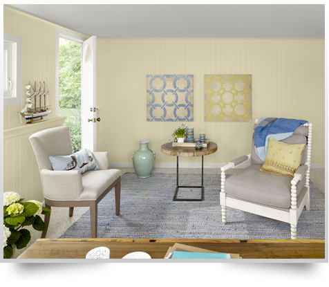
Take a look at some of the new fall fabrics. Yellow, which you could not find for many years unless you were looking at children's fabrics, is back! We're seeing this soft as butter yellow paired in fabrics with grey - which is not the stuff of baby nurseries! Instead, this touch of sunlight warms the cool, sophisticated grey tones that are replacing all the browns we've been seeing these past few years. A sense of optimism and simplicity permeates these new tones. You feel warmth and comfort just stepping into the room below! And after the turmoil we've been through as a nation with the economy in recession - it's nice to see that things are now looking up!     

               Home office room in yellow Benjamin Moore paint
Room by Benjamin Moore


Friday, October 5, 2012

Baubles, Bangles and Beads, Oh My!

I've been thinking filing a post about baubles, bangles and beads as part of contemporary design for a while now. So when I walked into a customer's home this past week to help her complete her newly redecorated space, I found myself truly inspired!
http://www.restorationhardware.com/catalog/product/product.jsp?productId=prod691015&cm_ps=modal_add_to_cart-_-none-_-other_items_you_may_like&categoryId=cat1701013

This chandelier has such a sense of fun - the ornate, very traditional crystals combined with the contemporary rustic orb - I love it!

Which is my point - you don't need to be Queen Victoria to add a touch of elegance to your decor - it doesn't need to be much - just some trim on a pillow or a lampshade or the bottom of a cornice is all you need to bring some bling to your space! Women accessorize their clothing by adding earrings, necklaces, rings and bracelets. They do so much to complete and complement the look. They boost self-esteem because you just know you look great! Think of your decor in the same way. Without the right accessories, the room feels incomplete. Plants, artwork and tablescapes are just the beginning. Take it to another level by layering trim onto your windows.


This is part of the Beaded Accents Collection available through Eddie Z's. Options galore to add a bit of sparkle to your window, pillows or bedding and give it that truly custom look. The cost to add these little extras is not prohibitive and will give your window or the entire room that WOW that catches every guest's eye and the finishing touch that makes you feel fabulous!

Wednesday, September 26, 2012

Ikat Anyone?

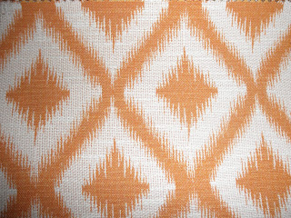
Ikat - you're seeing it everywhere, in women's fashion and home fashion. Where is this trend coming from and what is ikat anyway? Ikat is defined as a dyeing technique used to pattern textiles that employs a resist dyeing process similar to tie-dye (and who among you hasn't tried tie-dying a t-shirt?) on either the warp or weft fibers. We've seen it before - maybe that's why I get the "I feel like I've stepped back into the seventies" reaction from many customers when I present them with an ikat pattern as an option for their room. This trend is a way of reaching back to an earlier, simpler decade, yet giving a nod to the more complex, global culture that is today's world.

The fabric above is Ikat Fret in the Mango colorway from Robert Allen. Besides the striking pattern, it gives us that wonderful punch of the orange that is currently so popular. This fabric would be a pop of color in pillows or a fabulous graphic statement in side panels in a casual room like a family room. We've so "overbrowned" ourselves - from the chocolates, to the taupes to the beiges - that a bit of bright and bold - even in small doses - works to bring a room to life.

Don't be afraid of patterns like ikats - they make a room, and the people in it - feel happy!

Monday, April 30, 2012

Color Mystery Solved!

I went out to a customer's home last week to check out the installation of her blinds and drapery. We had worked on the window treatments before they had even moved in, since it was the parents' home that they inherited and were now rehabbing to make it their own.

It is always a bit of a mystery for me when I work with clients in that fashion. I had not even seen any of their personal belongings, so I rely on reading the personality of the client to make design suggestions. In this particular instance, I found myself working with Beth, who is bubbly, funny and a joy to work with. Her enthusiasm and sense of fun said bright and colorful, yet she was adamant that the drapery be as simple as possible to keep in line with their contemporary style. We chose a patterned white sheer with a narrow chrome rod that repeated itself on either side of the fireplace, on a french door, in a bay and in the adjacent dining room. Simple, yet elegant.

When I walked into the completed home that day, the mystery was totally solved!


The draperies had become the backdrop for a riot of color! All the glass pieces, the artwork on the walls and accessories (note the Tangerine Tango!) were the embodiment of Beth's personality - bold, sunny and happy. The drapery was the antithesis - quiet, yet beautiful. The final result is a home that energizes not only the occupants, but anyone who walks through the door.

Moral of the story? Color in a room should be a reflection of who you are. Whether the color is in your accessories or on your wall, surround yourself in tones that make your place a source of daily inspiration!

Monday, April 16, 2012

Tango Anyone?

Have you ever thought about color? About why you are seeing so much more grey in furniture right now? Or how Avocado Green became the color of choice for refrigerators many years ago? There is a group whose only job is to think about color. They are called the Color Marketing Group (CMG). They are the ones who actually determine what next year's car colors will be or what colors you will be drooling over when you choose those roman shades for your bedroom.

How do they decide what colors you'll be seeing in the next year or two? Where do they get the inspiration to inspire you? It's both simple.... and complex. They take a look at what is going on in the world. One key element they look at are economic conditions - and as a country we seem to be on the upswing - so right now the colors are bright and cheerful. Just the tonic to bring us out of the economic doldrums of the last few years! Pantone, the world-renowned color communication company used by interior, fashion and print and product designers has named Tangerine Tango as the 2012 Color of the Year.  "Tangerine Tango, a spirited reddish orange, continues to provide the energy boost we need to recharge and move forward." - Pantone.com

An entire room of such a bold statement is probably too much for most people to handle. But, think about Tangerine Tango as an accent! Maybe in a couple of custom pillows against a neutral sofa or on a hotel-inspired neutral bed? This is a tone that would pop with greys, taupes, beiges or creams. If you want to be really daring, pair it with a complementary color - a turquoise - just in small doses - and really make your room sing! 

I'll be exploring more about color in upcoming posts....

Thursday, April 5, 2012

Your Room Portfolio

Whenever I design a fabric window treatment for a customer, I try to remember to have a memo sample sent to them. This benefits the customer in a few ways. First of all, this will help them to remember what fabric we chose. After only seeing a fabric for an hour or so, one can quickly forget just how fabulous that pattern was in the room! It adds to the anticipation of the new look we have designed and helps to jog their memory, so they can further plan the room.
Memos are a terrific way to keep a record of your room. Whether you are out shopping for accessories or looking for a new sofa, collecting samples of the pieces of the room in a room portfolio makes for easy shopping. You can use a simple manila folder or upgrade to an accordian folder (four sides, nothing falls out!) to separate by room. Put as many swatches from the room as you can collect - drapery, sofa, chairs, carpet, paint chips and/or wallcovering. If you've got arm covers for a chair or sofa, this is the perfect use for them! Keeping them on the arm causes the fabric to fade unevenly, plus they look awful! Keep them under a cushion or put them in your room portfolio. Use photos for the things you don't have swatches, it's so easy now with camera phones.
I am a great believer in working in the room you are decorating. But that is not always possible when you are buying accessories or upholstered pieces. Taking those few extra steps will save you time and mistakes in the long run.  You may want to take the accordian folder a step further and keep the invoices and care and cleaning guides in there as well. Don't forget a photo of the finished room!
Voila! Everything organized in one spot!

Thursday, March 22, 2012

Slider Solutions

You probably have one in your own home.... the ubiquitous sliding door that leads to a balcony or a deck or a patio.  Unless you are in a situation where you don't need privacy or to protect your furnishings from the sun, you probably want to treat it with some kind of window covering. The quick and easy fix was always a vertical blind. And they still are a great solution for that situation - economical, attractive and practical. But if I had a dollar for every time I heard "I hate verticals, what else can I put on my slider?" - well, I would have a lot of dollars!
There are plenty of other solutions available when treating your sliding glass door. First of all, you need to answer a few questions.
What room is it in? If it is in the kitchen, you may be getting a face full of sun at breakfast, or at dinner and want to control your light differently depending on the time of day.
Does it get much use? Are the kids or the dog going in and out several times each day (or hour)?
That is going to lead you to your next question - Vertical or horizontal? In reality, any product can be used to treat a slider, but vertically moving products may be a wiser choice if your door gets used frequently throughout the day.
One of the up and coming products, popularity wise, is a product called panel track. The one pictured here is an Eddie Z's woven wood, that serves two purposes - as a sunscreen and as a decorative complement to the adjacent windows with woven wood roman shades. This family had a wonderful, private backyard so their concern was not privacy. You can also use semi-opaque or opaque fabrics to suit your particular needs. The panels, which you can vary in number or width depending on the width of the window, slide open and stack behind one another allowing easy in and out access. I think this is a great option to a vertical, especially in a more contemporary room. They are moderate in terms of price range so you can get a lot of bang for your buck!
No, vertical blinds are not the only choice out there! When you set up your appointment for the new look on your slider, we can review all your options and choose the right look for your situation!