Wednesday, April 19, 2017

Power to the People

It is amazing what technology has done to change our lives! Now, mentally I do not consider myself "old" (checking the calendar - the reality might be a "sort of"). But it wasn't so long ago that I did not have a phone with me whenever I left the house. Now, like most people, I feel naked if I am without that 2 3/4" x 5 1/2" lifeline. Why is that? We survived quite well for years without being constantly attached...

One of the incredible things these little technology wonders now have the capability of doing is to control our window treatments! Always the innovator, Hunter Douglas has designed an app can allow the homeowner the ability to manage their PowerView motorized window shades right from their smart phone or tablet. Providing you with energy savings, security and convenience whether you are at home - or not!

I've seen an uptick in the requests for motorization over the past few years. You can motorize just about any type of window treatment. Often, customers request motorizing to control window treatments that are difficult to reach...


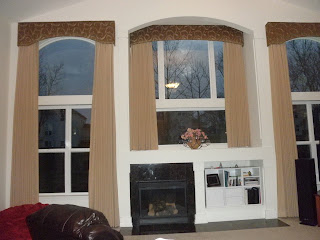
The center drapery in this room is set up and far back, making it virtually impossible to open and close unless you climbed onto a ladder each time. While the homeowner was able to operate the very tall drapery flanking the center manually, they opted to motorize the center to control the light and privacy in their large family room.

 
This customer chose to motorize their two walls of Luminettes by Hunter Douglas in their living room. Not because it was difficult to reach, but strictly as a convenience. I have found not only the younger, tech savvy homeowner is opting to motorize their window treatments, but the older consumer as well. It makes their lives easier and eliminates the "heavy lifting" of treatments that may take some physical strength or flexibility to move. This was the case with one of my customers recently - an older couple needed to control the light in their great room, yet both were incapacitated and confined to large recliners during the day. Motorization gave them the flexibility to control the glare off the television and give them privacy when needed. 
 
Predicted to grow exponentially over the next several years, motorization is no longer just the big boy toy. With the emphasis on child and pet safety, motorization has become a very viable alternative. Like the price of big screen TV's, we have seen the cost of motorizing our window treatments drop from being an unattainable luxury to an option to be considered for any room in your home. The power is in your hands!
Tuesday, March 7, 2017

Let the Sun Shine In

Over the past few years I have seen a resurgence in drapery. By the way, drapery is the correct term, not drapes - "drapes" is a verb not a noun. But I digress. I'm so glad to see drapery as a current trend! Not only are you providing wonderful insulation against cold and heat, but it affords you the opportunity to show off some beautiful fabrics that can pull a room together with color and/or pattern.

I recently completed a job for one of my favorite clients - she and her husband built a lovely home that backs to a country club golf course. They enjoy a fabulous view from the two story great room and from their master bedroom. Which is great, most of the time. When they moved in, we installed Hunter Douglas Alustra Silhouettes with PowerView motorization. The Brio pattern is the prettiest pattern offered in Silhouettes and we used it in different colorways throughout their first floor.

Except that still left the master bedroom upper specialty shaped windows uncovered. Not great for those weekend mornings when you want to sleep in! When Lynn and I met to discuss this challenge, we both agreed that keeping as much of the window open when they were up and around was important - they didn't want to lose that fabulous view! Contributing to that challenge was the slope of the ceiling. We couldn't bring any kind of drapery rod far out from the window because of the angle of that ceiling.

Our answer: ripplefold drapery! Unlike traditional pleats, ripplefold drapery allows for a tighter stackback so more of the glass can be cleared. It's a simpler, more contemporary look that is used frequently in urban lofts, but translates well to a transitional style like Lynn's.
 
With the tight amount of space available for the drapery when opened, the ripplefold stack allowed most of
the glass to still be visible.

 
When closed, the strong light that pours in on sunny days is no longer streaming directly at those trying to sleep.

 
The luxurious deep folds sit under the custom Designer Metal Ripplefold Rod, because the ripplefold system is a snap tape system that allows for maximum stackback. With a ripplefold drapery, you can also reduce fullness to give even more clearance or increase fullness for a sheer fabric.
 
This style has quickly become one of my favorite recommendations - it brings Grandma's draperies into 2017. It's about time, don't you think?

Friday, February 3, 2017

High Contrast, High Reward

Like many design junkies out there, I am a big fan of HGTV and websites like Houzz. It's always fun to follow trends and (let's be honest) judge the designs others have done. Besides these guilty pleasures, with my position as an in-home design consultant for Eddie Z's Blinds & Drapery, I have the pleasure of visiting many different homes. Consequently, I pick up ideas to use for both myself and other clients.

My current favorite idea is one I've decided to use on my entry staircase. Having been in this business for a quarter of a century (!), and living in the Chicago area my entire life, I have had my fill of oak! Like the Midwesterners that love it so much, oak is a wood that is very sturdy, with a strong grain, yet still warm and beautiful. While I don't want to lose the benefits of this hard wood, it's time to give that golden oak a new, fresh look. So, my plan is to paint the treads and the handrails of the staircase high gloss black, while also painting the risers and the spindles high gloss white! The impact will definitely get attention when you walk through my front door!

Using a high contrast in a window treatment can also take a room to the next level. This Barrington client has been remodeling her older home for a while, but she has done it the right way. By taking her time in making design decisions, she has turned the 1st floor of her home into a show stopper! When I came along, I quickly understood that Sheryl loved to use strong graphic fabrics that make a statement and will complete her beautiful rooms. One of the most striking treatments we've done so far is in her dining room.

 
Simple flat roman shades, yet the high contrast pattern (Robert Allen - Lewis Range/Chalkboard) finishes the room in stunning fashion. There is a reason you are reading black type on a white page - it stands out! This particular fabric is actually a charcoal gray, yet the light to dark not only of the pattern but the wide white trim against the dark walls pull the room together to make an impact when you enter. You can't miss it!
 
Another less permanent way to achieve that high contrast visual is with your family photos grouped on a wall. By using simple black frames and wide white matting, you can draw new attention to those treasured shots as they become a statement work of art. It serves a second purpose by unifying what may have been a hodge podge of images and gives you the opportunity to change the photos as seasons change or children grow.
 
Now I just have to get to work on those stairs...

Thursday, December 17, 2015

It's Deja Vu All Over Again


This is a kitchen I designed for my client, Holly, probably 20 years ago. The wallpaper, the florals and the balloon shades probably give the time period away. But, look at the colors - rose and blue.

So, it with no further ado that I share Pantone's Colors of the Year for 2016:


Wow! 20 years later - they are back! And why not? Rose Quartz and Serenity. They are soothing, comfortable, soft hues that evoke a sense of calm in these turbulent times. And in our "keep it until it rots" Midwestern sensibility, these colors are sure to be quickly embraced. Chances are, many of the accessories that worked with this color scheme 20 years ago are still in use! 

In the case of Holly's kitchen, (did I forget to mention the windows flanking the slider have rose pleated shades under the valance?), how could we update the look to bring it into 2016? If the wallcovering were staying, changing out the handles on the cherry cabinets and installing new light fixtures would be an inexpensive update. Removing the original window treatments and installing a neutral Duette Architella Honeycomb Shade by Hunter Douglas on the small windows with a coordinating Vertiglide on the slider would keep the softness and allow the room to open to the outside. I'd replace that balloon with a much simpler treatment and push it all the way to the ceiling to further open the expanse of glass. Possibly a stripe or even a banded solid would be a good choice. And instead of the laminated tablecloth (she had little children at the time, kept the table practical), I might coordinate custom chair pads with the top treatment and use placemats instead.  

So, if you find yourself looking at home decor or women's clothing in the next year and start to feel like you've done this before - chances are, you have!

Tuesday, September 29, 2015

Window to the World...While you shower?

I grew up in a house that was built in 1959. There is a window in the main bathroom. That window is a glass block window - great for letting in natural light along with a window sill for my mom's African violets. You still had privacy and never gave a thought to adding any kind of window treatment.

Something happened since that time that lead to architects and home builders adding windows, big windows, into bathrooms. Especially over the bathtub. Yes, they brought in wonderful natural light. But they also brought out our sense of modesty. Who wants to shower in front of the neighbor's kitchen window 15 yards away?

I'm not complaining! The home builder's thoughtless design has been a consistent source of revenue for those of us called to treat those windows.

Treatments that can go down from the top as well as up from the bottom are frequently the solution to allow light to come in while keeping privacy. Cellular shades like Duettes from Hunter Douglas, seen in this customer's bath, are a great choice. Roman shades are another treatment that you can add


the top down bottom up function, giving you the "pretty" along with the practicality.

Frequently, builders will use bathrooms to feature a specialty shaped window - throwing yet another monkey wrench into the search for privacy in the most private area of the home.


Once again, this builder chose a huge corner window, topped with arched windows, and placed it right over the bathtub. Here we chose Silhouettes from Hunter Douglas as the solution, giving both beauty and practicality. The sheer of the Silhouettes on the bottom, even as the shade is open, provides some daytime privacy for the owners. They can close the vanes in the evening as they see fit. The specialty arches above can be ordered either in the permanently open or permanently closed position.  This customer wanted the closed position, not only for privacy, but to cut the morning light that streams into the adjacent bedroom.


This window was a particularly tough situation. A powder room that looked out onto the front porch of the home, this window demands privacy. The small, oval shape did not fit into most blind or shade options. And, the customer did not want to spend a small fortune on the smallest room in the home. Budget quickly eliminated the custom shutter option. They also did not want a permanent covering, such as a fabric sunburst, preferring the ability to choose open or close. The solution: continue the wood blinds we had put throughout the home. The integrity of the oval window can still be seen, both inside and out, plus the light can still be controlled!

In the end, there are a number of different solutions to treating that "window to the world" in your bathroom. We can have that natural, flattering light we crave when it comes to putting on makeup in the morning. But, we can also have the privacy we need when we step out of the shower before that!


Thursday, August 20, 2015

Panels are on Track!

"I hate verticals!" I hear that from customers at least twice each week! Verticals have been the "go to" treatment for sliding patio doors for years. Like the Avocado Green and Harvest Gold of a generation ago, people remember them as the flimsy plastic vanes from their first apartment and cringe at the thought of putting them into their newly decorated home.

But wait! Practically speaking, they are a great option for families with kids and/or pets. Plus, they are one of the more affordable treatments for an opening of that size. There are many more choices in the present day vertical lines that allow you to enhance rather than detract from the decor in your room.

Still not convinced? Then panel track may be your answer!


Definitely a more contemporary option, panel track can be many different looks - anywhere from prints like the pattern in the photo to neutral solids. Coulisse is a European line exclusive to Eddie Z's in the Chicago area and boasts fashion forward prints and colors unavailable anywhere else. In this customer's space, we were working with greys and mostly solids, as this was right off the kitchen. The fun and unique design added some needed punch to the room! And since there is a young child in the house, messy fingerprints can be easily wiped clean from this practical material.

Panel track fabrics can also coordinate with the windows in your room that demand a horizontal treatment instead of a vertical, because they utilize the same fabrics. Sunscreen fabrics, woven woods and room darkening are other options available in this kind of treatment. A bit pricier than the typical vertical, but still affordable. Worth considering when you are treating those sliders or other large windows, panel track may be your answer to those verticals we love to hate! 


Tuesday, June 9, 2015

When Pricey is (K)not a Good Idea


This is the end result of a master bedroom we just completed for a retired couple in Barrington. My photography doesn't do it justice - it's better in person! The wife really wanted green to be her main color in the room, despite the protests of her husband! So to keep them both satisfied, the green could not be too pastel. Nor did they want it too dark. If you've searched for green fabrics recently, you know they currently are not easy to find. Originally, we did find three beautiful choices all within one book. The drapery fabric we chose is Robert Allen Ponderosa Pine/Fountain (and also used in an accent pillow).

Ponderosa Pine/Fountain by Robert Allen

We chose to use the light fabric at the window, over the newly installed wood blinds, to keep the windows light and bright, while using more of the green on the bedspread. More practical, plus more impact visually.


Kilties/Fountain by Robert Allen

Kilties/Fountain is used in two other accent pillows. The customer wanted a throw bedspread, so there were several yards of fabric involved.

Her first choice was:

Knot Along/Dew by Robert Allen

Knot Along/Dew out of the same Robert Allen Color Library book. Beautiful fabric - except for two major challenges - 1. it is 85% linen making it a costly choice and 2. it is 85% linen making it a very wrinkled choice for a bedspread!

I liked the idea of a tack quilting for a fabric of this type, but I needed a more user-friendly and a more budget-friendly choice. 

Using a basic cotton duck from Carole Fabrics (Daydreamer/Chambray) and using a tie tack quilting in a white of the same pattern (Daydreamer/White), we achieved a look that was similar but of a better scale than the original choice. 100% cotton will perform beautifully in both looks and wear and we were able to stay within budget! 

And, both wife AND husband were happy!